


Overview
Creating a campaign that raises awareness and drives actionable change towards victims of modern slavery in New Zealand.
Team | Split Shift Studio
Eilish Neal | Team Leader
Scarlett Kang | Graphic Designer
Mehmet Gultekin | Motion Designer
Jules Castillon | Motion Designer
Jayme Ducommun | UX/UI Designer
Contributors
Gary Shaw
Cam Bower
Media Design School Lecturers
Jocelyn Janon
Tammie Leong
William Kusuma
Don Chooi
Jim Murray
My Role
UX Researcher | UI Designer | Front-end Developer

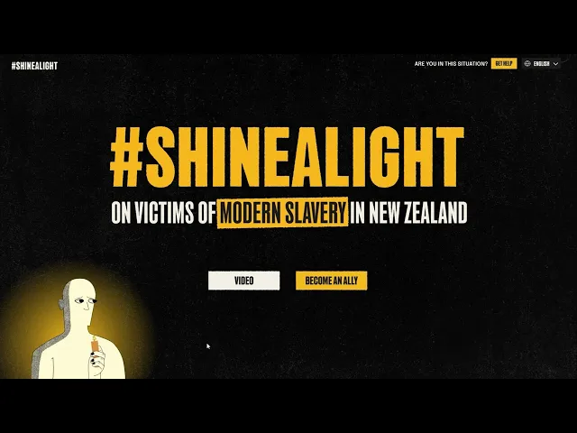
The Problem
Modern slavery is a hidden crime that exists within many of Aotearoa’s most successful industries, affecting every single one of us and underpins much of the success our country celebrates. In 2021, it was estimated that around 8,000 people were living in slavery in Aotearoa, with the majority being vulnerable migrants, lured to our shores by false promises of a better life for themselves and their families. The problem is, most of our population doesn’t even know this kind of exploitation exists, and are unaware it is often happening in plain sight.
Our challenge was to design a campaign that would promote awareness around Modern Slavery in Aotearoa and inspire an audience to take action-taking measures to combat and challenge its existence.
Process
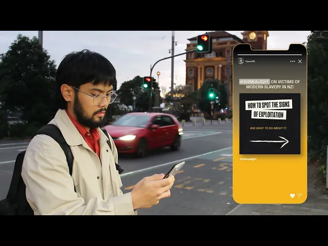
wEBSITE cOMPONENTS
As part of our solution in promoting awareness and allowing the audience to have information ready to combat against modern slavery, the website needed to follow specific criteria, such as:
Collaboration
Being such a complex and hidden problem, we sought out New Zealand modern slavery specialist Gary Shaw and migrant exploitation investigator Cam Bower. With this collaboration, we were able to ideate and execute a realistic campaign outcome.
Gary Shaw (Left) and Cam Bower (Right).
User Testing and
Development
Through-out prototyping the website, user-testing was an essential part of development. Not only to observe the user-journey and their thought-process when interacting with the website, but to also receive feedback for the branding, visual design and copywriting.
Final Result
By rallying together communities of fellow migrants who recognise exploitation, and can communicate with and support victims, we have the ability to ensure that every individual who is residing in this country has a fair chance. We pride ourselves on being the land of freedom, opportunity and growth, but as modern slavery specialist, Gary Shaw rightly asks, "If our trade, prosperity and growth is built on the backs of people in slavery, what kind of "success" are we celebrating in New Zealand?”.
This campaign harnesses the power of awareness and education to build a community who not only recognises the signs of migrant exploitation but are driven to take meaningful action by standing alongside victims, amplifying their voices, and holding exploitative employers accountable. Because true progress isn’t measured by economic growth alone, it’s defined by the dignity, freedom, and fairness we extend to every person who calls this country home.
Website Walkthrough
Campaign Walkthrough